Shara Chwaliszewski
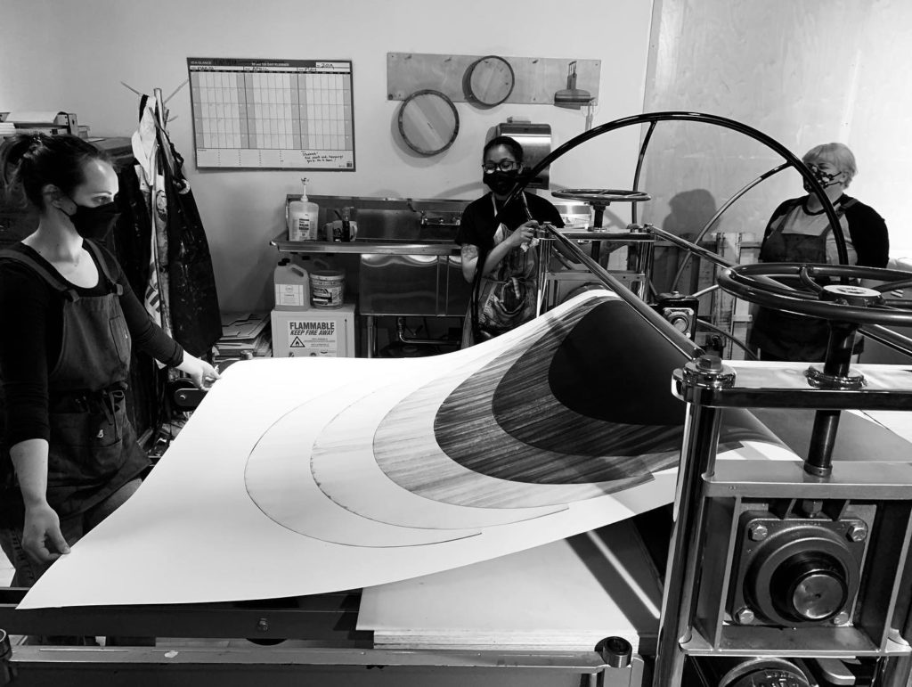
Students from the MFA Print Media program and Watershed Center for Fine Art Publishing and Research, PNCA. Photo courtesy of the artist.
“I like how the registration kind of goes off here,” Chris Chandler explains, leaning as he gestures. Chandler and I are walking around the gallery, talking about his recent show, Modular Shifts. Much of his work as a large-scale abstract letterpress print artist incorporates layers and torn areas, resulting in little disruptions of information, interruptions that the eye skips across as the brain inserts its own connections. “I like to disjoin a bit,” he continues, “so it just breaks it up and it’s not these complete shapes or circles; it has that disconnect which I enjoy.”
Challenging the conventions of letterpress through these subversions of tradition, Chandler’s practice is at once autodidactic, disciplined, and iconoclastic; open to the opportunities presented by chance and error; and fostered by engagement with other artists. Chandler’s printmaking is a second act, and his thirty years blending and balancing sound for touring bands informs his work. Musical references come up often in our conversation, often serving to reveal structure, a constraint Chandler both accepts and challenges.
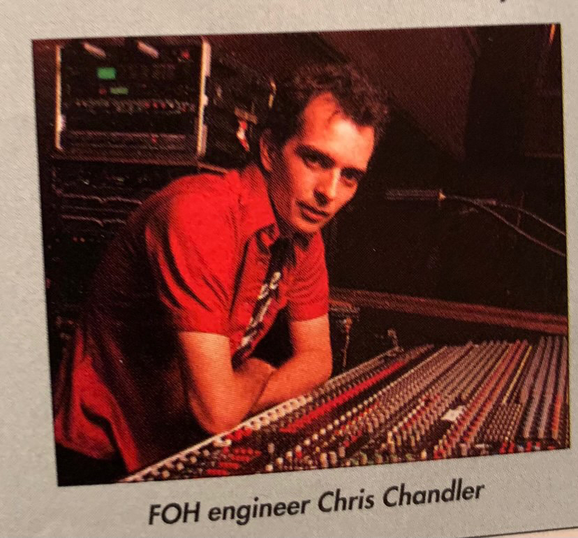
At work mixing sound. Flaming Lips Tour, San Francisco, 1999. Photo courtesy of the artist.
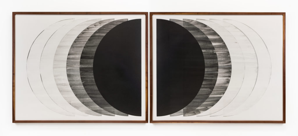
We are standing in front of The Space Between Us, a rare collaboration between Chandler and rubber stamp artist Savvas Verdis created during the height of the pandemic. Chandler prefers to work alone or with an assistant in his Portland studio, using a 5000-pound Vandercook 232P letterpress machine and large-scale woodblocks. “We were supposed to get together and do a project and the pandemic hit. Verdis came up with the space between us line which means two things to him: one is I’m in Portland, he’s in London, and then also he teaches economics. During the pandemic, we all saw more class separation, the spaces between the wealthy and the poor. So I printed the words underneath. You can see them kind of bleeding through, and you can also see it through the tears.”
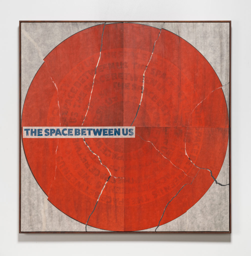
The Space Between Us, 2021, Monotype relief print on Kikakura paper, mounted on panel, framed in Walnut, 48″ x 48″ x 2″. Courtesy of the artist and Elizabeth Leach Gallery.
Although they don’t feature in all the pieces he makes, the tears are one notable characteristic of Chandler’s style, and they set his work apart from most printmakers. As we look more closely at The Space Between Us, he reminisces about an early show of his prints. “The first show I was doing was with a print group that was teaching and wanted to show some of my work. They panicked thinking it all got destroyed in shipping, like someone went in with a knife or their keys and tore it all. They liked it after we talked about it, but the initial thought was fear. I had to explain to them that was not the case; it was supposed to be that way.”
Chandler taught himself printmaking during his sound engineering days. He laughs as he says, “I never took classes, and I never went to school, so I didn’t learn the correct way to do it. A lot of the way I do it I made up as I went along. Maybe I can’t unteach myself the way I do things. It seemed to come naturally. I did posters and a lot of ephemera when I was on the road. We did popcorn boxes for a party, things that were meant to be cool but disposable. When I quit touring and wanted to do my own art, I had the idea of using the letterpress machine as my way to make art. So instead of the paintbrush or instead of whatever I chose a huge 5000 pound machine.”
Standing in front of Modular Shifts, the 18’ x 10’ relief print installation that gives the show its name, Chandler considers a potential project. “I would like to take like a wall like this and use these patterns but do it like it’s a drumbeat. So that circle would the kick, that would be the snare.” He trails off, his gaze not so much at the mural on the wall but the ones building in our heads as he speaks. “I want to try and do patterns in a bigger way. Not that anyone would know that’s a drumbeat, but they might see different rhythms.”
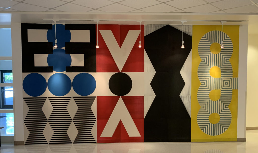
Modular Shifts, 2022, Relief print installation, 18′ x 10′. Courtesy of the artist and Washington State University, Vancouver.
When I ask Chandler what ambitions he has as far as scale, he begins by talking about the transition from the music industry to full-time art-making. It was then that the scale of his work shifted. “I got invited to Print Week in St. Louis, right when I got out of touring, and they said bring your posters and talk about poster-making. I thought, everybody does that, and my wife said: do something big. Take what’s on the page and put it on the wall. Like when somebody walks into a venue, you’ve got the band on stage, you look up, you see it. I wanted to figure out a way to do that.”
Modular Shifts, Chandler informs me, will be recreated on the outside of a building. “I’ve done two or three of these about this size. A developer wants to take a piece like this and have it on the outside of their building, six stories tall. What they’ll do is they’ll come look at this, they’ll take a picture of it and get closeups, then they’ll give it to a mural artist who will recreate it as a painting, but they’ll try and get all the [tears and] inking marks.” Like scale and abstraction, these inconsistencies are now considered worth preserving as hallmarks of Chandler’s work, but he tells me, “when I started doing this and posting about it a lot of printers would reach out to me and said hey, I can help you, why are those marks on there, why is it torn, you don’t have to do this, why is it this way? They were struggling with it. Printmakers are the nicest people around and so willing to help and willing to share information, but also I think that it’s a very precise and technically driven practice and when they see you get done with a print after you’ve worked so hard on it and you tear it, it’s a bit of a “why did you do that?” moment for other printmakers.”
Fade-Out, 2022, Variable relief print on Mohawk Cotton paper, 11′ x 54.5″ Edition of 5, co-published with Watershed at PNCA/Willamette University. Courtesy of the artist and Elizabeth Leach Gallery
“It’s not for everyone,” Chandler continues with a wry smile, as we look at Modular Shifts and Fade-Out. “The ink wiping that I like to do came from when I was cleaning a wooden block and ran a page and thought it was kind of cool. I worked up this system of inking by hand with the rags and diluting the ink with burnt plate oil and Gamsol [mineral spirits], and I vary it depending on how dense I want the color. The trick with the ink wiping technique is control. I control the exact amount of ink that’s on the rag, as well as the pressure, so it takes a little bit of time for me to figure it out.” Those inconsistencies enliven the lines and shapes that begin as separate marks, coalesce into lines that connect and then disconnect, their registrations slightly off, reaching towards each other across divides. in all directions the motion stutters across the barriers, providing a little frisson, a thrill of something slightly askew. “I like it, Chandler explains, because it adds movement and depth to the piece; it adds something that’s not normal in the print world.”
What’s normal, or at least conventional, in the letterpress print world, is smaller work that transmits encoded visual information. Words. Alpha-Blox, one of the modular types that Chandler uses in his work, consists not of individual letters but of “curves, straight sections, L’s, T’s, U’s and other patterns,”[1] so that letters as well as borders can be built from the parts. Chandler acknowledges that “when you think of letterpress, at least when I do, you get a lot of people that mention wedding invites, broadsides, smalls, things like that, you don’t think of a big piece.” Chandler uses two-foot square wood type versions of the metal type, printing, repeating, and combining the disassembled letterform segments to create his abstractions. They’re not informational in the way people expect letterpress pieces to be, and certainly nowhere near the same size.
Other works float on the wall, empaneled and framed, hung but still seeming unconfined, as if they were about to tear themselves strategically and reveal a new layer. The tear concept, Chandler tells me, came about through capitalizing on error and good advice. “I had come up with the idea of printing pieces and wheatpasting them on panels. When I did the first one, I had my design, I had my four [printed] pieces, 48” by 48” ready to go. I went down to the lumber store to get a piece of plywood and I told them I needed it cut down; they said it’s fifty cents a cut and it’s not going to be accurate, but we’ll get it close.
I got back to the studio, and it wasn’t even close. There was all this space where the [four] prints weren’t connecting. My friend Max Collins, a street artist who works with wheatpaste, said, ‘when I wheatpaste I’m up two stories, three stories or wherever and I’ll tear the print and move it to the edge, so it makes the edges all the same. From two stories down you don’t see the little tear. He said let’s just do that, so it’s all even; we can see how it fits and don’t worry about the tears.’ We did that, and I just sat there and stared at it, for about a week.
Then I was in my studio and my friend Lisa walked by, and asked what I was doing. I said I’m looking at this and I really like it, but I don’t know if I should tear it or leave it. She said that’s easy: if you want to be a designer, don’t tear; if you want to be an artist, tear. The tears were a lot more at the beginning; I tamed it down a little bit, got a little more calculated.”
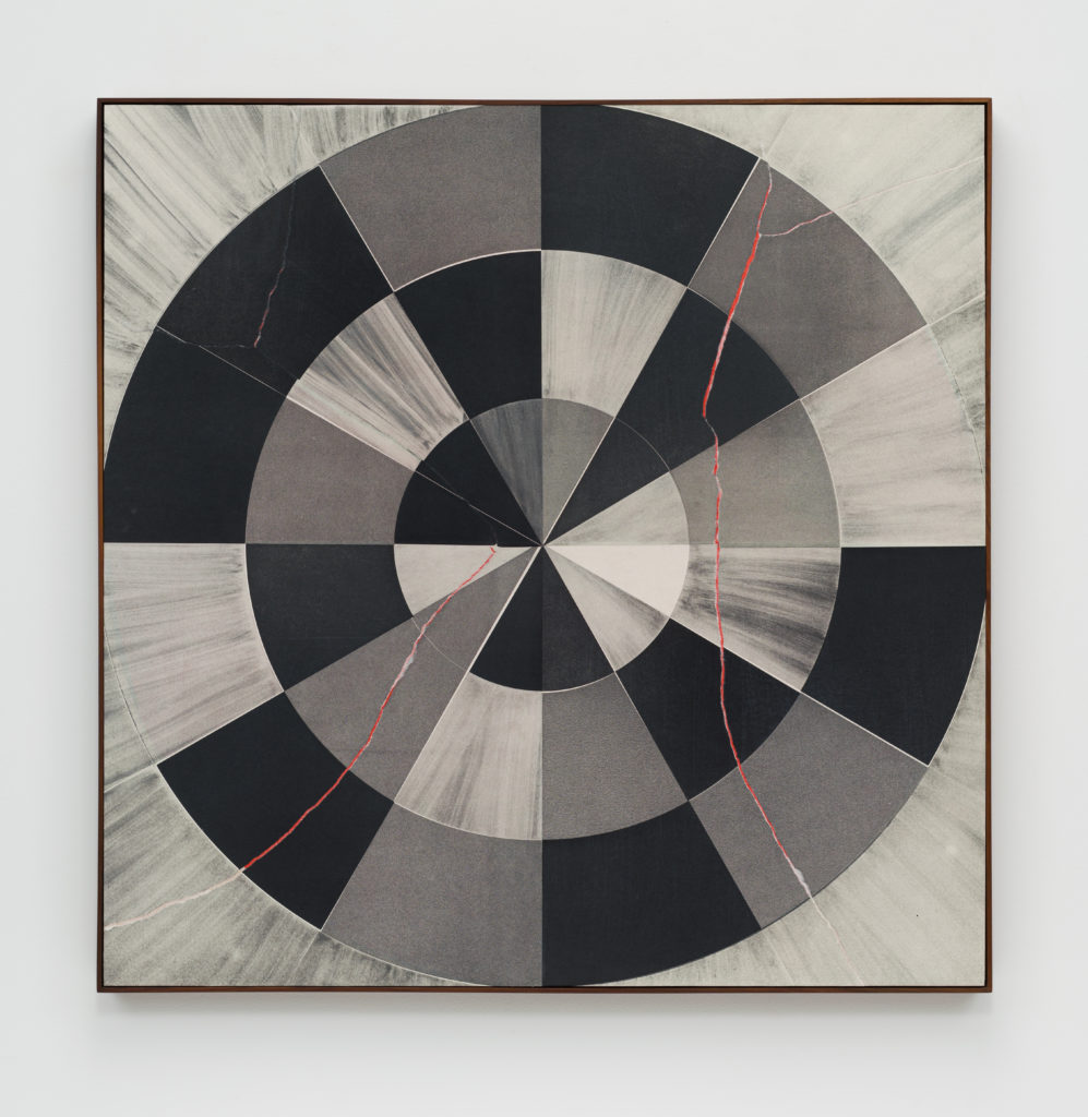
AB039, 2022 Monotype Relief Print on Awagami Kozo paper, mounted on panel, framed in Walnut, 48″ x 48″ x 2″. Courtesy of the artist and Elizabeth Leach Gallery
That mix of intention and experimentation results in pieces that may not appear related to Chandler’s original ideas. Chandler considers plans a useful starting point from which to diverge as opportunities for exploration present themselves, a sometimes necessary “you are here” to navigate from and towards. When I ask Chandler how his designs come together, he gives me an example: “I have little 2” x 2” cut outs of all these fonts, backed with a little cardboard. I carry them in a bag and lay them out in designs and stack them. Like a little laptop, but analog. That’s a good way for me to start building ideas and shapes and that’s what I do for the bigger pieces like Modular Shifts. The smaller ones come together more just when I’m at the press; I’ll be just messing around with them and [they] kind of come together as we go.”
With some of the bigger 4’ x 4’ or 4’ x 8’ prints I’ll spell out a word or a letter, and then I’ll start scrambling it. I have a loft in the studio with a big open space, so I’ll spell out the word, go up in my loft and look down, run down the stairs, and turn a few pieces and run back up, run down, and turn a few pieces, and just go back and forth until it turns into something. That way it’s a starting point, but also abstract. People may never figure out the word, but you can tell [looking at Modular Shifts] that’s maybe a V, that could have been an E at one time and an O or number 8. So, it’s all familiar for some reason but not obvious which I like.”
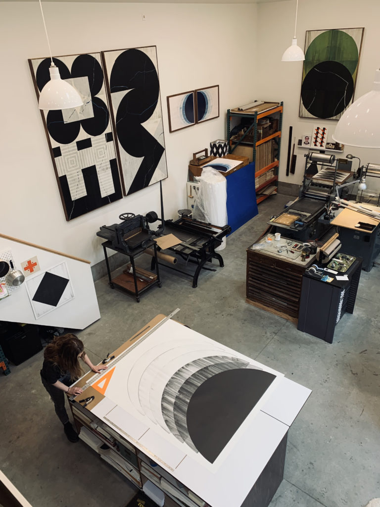
Chris Chandler’s Studio. Courtesy of the artist.
The titles of Chandler’s work are numbered, a reference to his love of music and a way to provide a loose chronological organization. Standing in front of AB039, he explains that “when you’d collect Impulse Jazz or Blue Note records everything would have a number on it, so 001 you know that probably came out, what, 1966; it was kind of early on, and you can kind of see the trajectory. AB039 is the 39th Alpha-Blox one. You can look at all these and say okay that’s what he was doing at that time. I like that linear footprint that you leave as an artist.”
The next step is his first show with Elizabeth Leach. Recently signed by the gallery, Chandler has plans to add a sculptural and interactive dimension to his inaugural show, scheduled for early 2024. Again, as with the drumbeat mural he talked into being earlier in our conversation, Chandler shares ideas on work he dreams of making. “One thing I’m working on is making blocks, two feet by two feet by two feet, with shapes wheatpasted onto each side. We’ll have maybe eight cubes in the middle of the room, and people could come by and redesign it or reshape it.” He pauses, his gaze going off into the distance again. “So then you’d have the walls covered with prints and have something in the middle of the room that you can walk around, a kind of sculpture that’ll give you the middle space.”
And then, as so many times throughout our conversation, Chandler is talking about music and how his love of early punk rock sparked a new line of inquiry. “When I was fourteen, I got to spend some time with this band The Clash. I took a bunch of mediocre photos backstage, but they have a weird sense of the 80s, early 80s, just the band sitting around eating pizza or drinking a beer or hanging with the fans. I want to take some of those and recreate them, maybe one of Joe Strummer sitting up against the wall with a beer and do that in a 4’ x 6’ print. I’ve been experimenting with taking an old photo and recreating it as a wood block, and then underneath it I’ll have Alpha-Blox bleeding through the tears. I’m not sure that’s my new direction but it’s something to have fun with and mess around with.”
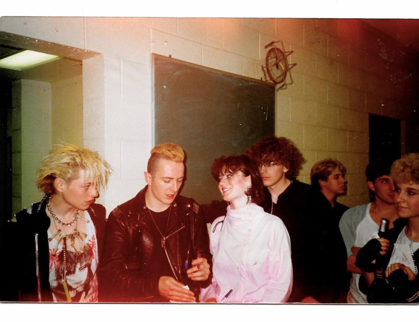
The Clash backstage with fans, St. Paul, MN, 1984. Photo courtesy of the artist.
Chandler continues to find unusual ways to combine and confuse visual information, often getting inspiration by capitalizing on the unplanned and unexpected. Even his choice of medium or, more accurately, how he has taken it to unexpected places through his improvisations, is unique. While there are other printmakers working with letterpress, his abstracted, oversized, and manipulated prints stand out, rhythmic messages thrumming steadily and then fibrillating breathlessly now and then, at a frequency always just beyond apprehension; a combination of the familiar and the unknown.
[1] Richard Kegler, “P22 Type Specimens: Alpha-Blox,” The Devil’s Artisan, https://devilsartisan.ca/p22_type_specimens_alpha-blox.html
Chris Chandler founded Neu Haus Press in 1996 after he acquired his first Vandercook Press in Venice Beach, CA. Through the years his love, talent, and knowledge for this vintage craft has grown. In addition to his love for printmaking, Chris spent 30 years working as a tour manager and sound engineer in the music industry and has had the privilege of sharing his passion for letterpress with a variety of musicians, leading to intimate collaborations and the opportunity to print their work. Currently residing in Portland, Chris is represented by Elizabeth Leach Gallery, Portland, OR.
Born on the east coast of Canada and raised on the prairies, Shara Chwaliszewski has made her home in the Pacific Northwest since 2006. Working in several mediums with an emphasis on discarded or found materials, she creates two- and three-dimensional images that are largely non-objective but often biomorphic. A Washington State University Vancouver alum (BA English and BAFA, 2021), and the Fine Arts Student of the Year for 2021, Shara works as a tutor at the campus Writing Center and makes art in her backyard studio.