Lisa Radon
All images courtesy Disjecta and Mark Stein
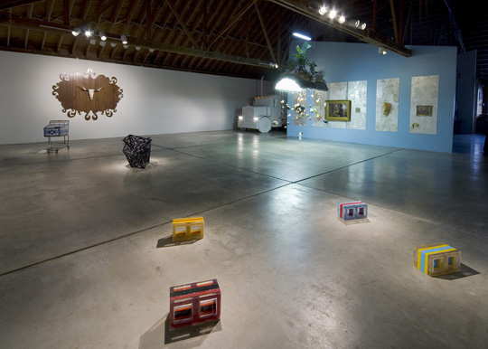
Disjecta Installation view
Clock wise from front – Sean Healy, Muscle Car Memory/Carcinoma; David CorbettGlass Houses I, Glass Houses II, Glass Houses III; Crystal Schenk, Holy Cow! ; West Coast Turnaround,Shelby Davis + Crystal Schenk; Bruce Conkle and Marne Lucas, Warlord Sun King.
I don’t need my biennial to be a traditional novel with beginning middle and end neatly wrapped up between two well-designed covers, but the somewhat hastily organized Portland2010 Biennial is more like a stack of paperbacks, classic hardbound books, and a couple of zines sprawling across time and space. What do we learn about the state of the arts in Portland via this cluster of solo and group exhibitions on a rolling schedule at venues ranging from blue chip and university galleries to abandoned buildings? Primarily that Portland’s art scene, even as it has matured, particularly in the last ten years or so, is still marked by a can-do or can-do-it-yourself spirit that has brought us other artist-built exhibitions like 2005’s Core Sample and even institutions like the late great Portland Center for the Visual Arts and the Portland Institute for Contemporary Art. In this spirit, if the Portland Art Museum won’t do a biennial (they last held the Oregon Biennial in 2006), then alternative arts space, Disjecta, with independent curator Cris Moss will step up.
There was a moment that Portland2010 wasn’t going to be called a “biennial” at all, but of course, the organizers wised up and realized that the word matters. The late Oregon Biennial that Portland2010 aims to replace brought emerging, mid-career, and mature artists’ work into the region’s premiere arts institution, the Portland Art Museum, many for the first time. Portland2010 may not be able to offer its artists that built-in institutional audience, and it likely won’t offer a pathway to being collected by the institution, so the least it can do is confer on the artists the status that being included in a “biennial” implies. And this group of Portland artists, selected by Moss (gallery director at Linfield College, OR), by and large richly deserve the honor.
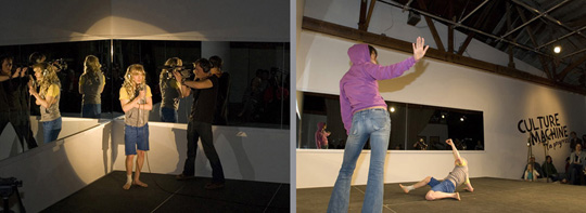
Tahni Holt, CULTURE MACHINE (In Progress), 2010, Performance still
Portland2010 artists skew younger. There’s not a painting to be seen (really? no biennial-worthy painting in Portland?). Contemporary dance makes the scene with Tahni Holt’s Culture Machine (In Progress). And the venues include watch-your-step warehouse-y spaces perfect for the installation work that is the big story of Portland2010. On the downside, much of the work has been previously exhibited in Portland, and recently. Some artists’ work ends up being privileged over others: some venues are out of the way, and artists are given wildly different amounts of real estate. One artist, Melody Owen, is given two at-bats, one of which is a massive solo show, a kind of meditative natural history museum.
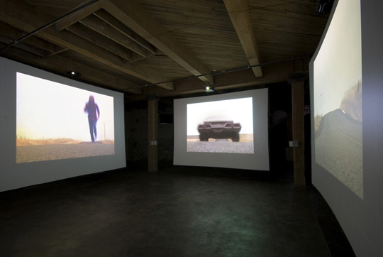
Stephen Slappe, Crossroads, 2009, Four-channel video and sound installation
While photography didn’t feel fierce or fresh, with Gregory Crewdson-meets-Cindy Shermanesque tableaux on one hand and photojournalism on the other, the moving image in the form of Stephen Slappe’s video installation, Crossroads, is both. A surprisingly visceral experience (the sound alone is cracklingly immediate) that toys with perception, Crossroadsputs the viewer at the center of the action in the middle of nowhere where the trajectories of two moving bodies intersect. By avoiding a whiff of narrative—the action as performed by the actor, is matter of fact, not dramatic—Slappe foregrounds instead the distance between viewer and viewed, a distance typically reduced to nil either, as an act of will on the part of the viewer or seduction on the part of artist. Crossroads questions that suspension of rationality (setting aside the “I am real, this is not real” divide) that viewer typically engages in without a second thought.
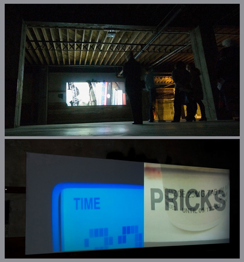
Pat Boas, What Our Homes Can Tell Us, 2009, Video still
Pat Boas’ What Our Homes Can Tell Us is a two-channel video installation reminiscent of Hollis Frampton’s Zorns Lemma. Here, Boas, too, uses found words from signage and the like, but while Frampton arranged the words structurally in alphabetical order, Boas arranges the words in a narrative manner. One wishes we could have seen some of her gouache paintings the size of New York Times pages that isolate a single element of the page to function as subtle critique of media and the greater culture. These have been shown recently, but then, so has What Our Homes.
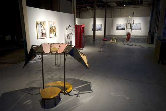
David Eckard, front to back – Apes to Apse (The Bat and Bottle), Steel, wood, canvas, mirror, leather; I Was Told There Would Be a Resolution (placards), Steel, fabric, wood, illustration board; Primer (ghost author), Steel, wood, fabric, illustration board. All works 2010
Much of the sculpture at Portland2010 implies narrative to many ends, promising or providing evidence of it with varying degrees of abstraction. David Eckard’s Mountebank (a moral decline) is a series of sculptures (with two works on paper) that employ the physical vocabulary of stage, podium, and puppet theater (down to the red velvet curtains). Eckard says explicitly that the works explore, “the anticipated gesture, untenable resolve and hollow confidence of the pitch, sermon, and spectacle.” But that’s only the half of it. Make a Venn diagram of pitch, sermon, and spectacle and what you’ll find in the overlapping center is performed identity with overtones of the mountebank’s petty criminality or at the very least, his flexible moral compass. For Eckard, the body has always been central to the work with sculptures as tools or vessels for performance; here absence of body from stage or podium fosters a necessary indeterminacy that allows for multiple readings from the personal to the political.
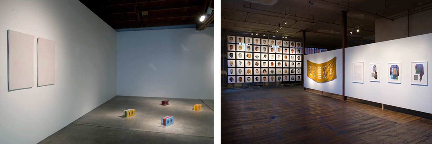
Sean Healy, Muscle Car Memory/Carcinoma, 2010, Acrylic, resin, hand-dyed cigarette filters (Left). John Brodie, Westworld I, II & III, Collage on paper; Faces (grid), Collage on paper; Faces (burlap),Textile on burlap; Billboard (grid), Digital inkjet prints. All works 2010 (Right).
Sean Healy’s installation Muscle Car Memory/Carcinoma is four brightly striped, resin breeze blocks upon which the imagined muscle car likely spent many years and two wall pieces whose surfaces are solid with cylinders of cigarette papers on end. This is evidence as narrative, the leavings of the action in a thousand driveways stands in poetically for labor, dedication, loss, and the decline of America’s manufacturing capacity and therefore, for many, the American Dream.
John Brodie, too, gets at the manufactured image of performed identity, and broadens the conversation to include the greater the real/invented with his fantastic, Westworld, named after the 1973 film of the same name in which robots animate an imitation Wild West vacation-world of the future. Brodie sets the scene with a wall of large collaged “billboards” and populates it with an army of photos of isolated heads on white grounds arrayed in a grid on the opposite wall. In the expanse between are Brodie’s photocollage portraits of luxuriantly haired “women” with landscapes standing in for faces. My friend, critic Eva Lake has pointed to John Stezaker’s photocollages as antecedents, but by situating these “women” in the context ofWestworld, Brodie supplies context that infuses them with narrative potential.
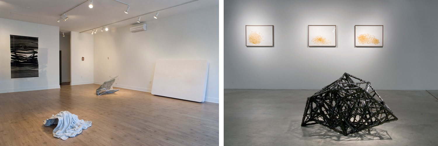
Heidi Schwegler, Installation view of Swimming Through Nitroglycerin, 2010 (Left). David Corbett, Past Craft, 2009, Enamel and wood;Glass Houses I, Glass Houses II, Glass Houses III, 2010, Shellac on paper (Right).
Heidi Schwegler’s crumpled, concrete-stiffened Bedspread is a highlight of her fine one-woman exhibition, Swimming Through Nitroglycerin that bends the domestic through a twisted prism. The fun-house quality of an upside-down step ladder embedded in the wall (“Untitled”) is instantly darkened by other objects including Fade to Black, a wrecked and black-flocked venetian blind as well as the untitled, crumpled plastic basket of a grocery cart.
David Corbett’s sculpture, Past Craft, explores structure itself from the inside out with a deliciously complex huddle of line and node coated in gloppy, glossy black that echoes the structures in his shellac-on-paper drawings nearby. With overtones of a Bucky Fuller structure gone haywire, it’s as if minimalist sculpture’s cool shell were pealed back to reveal a ridiculously complex, overbuilt and redundant armature. Even more interestingly, Past Craftshares with an element of Damien Gilley’s installation (below) the sense of a drawing in three dimensions.
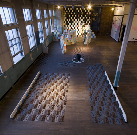
Oregon Painting Society, HexenHouse, 2010
The year of the installation meets the year of the arts collective/art band in Oregon Painting Society. They don’t paint, but they do create suggestive environments and performances. Their sprawling HexenHouse is a small house set in a landscape of pathways through tiles of flower petals and grey sand lined with walls of boxes silkscreened with invented hieroglyphs. Inside, a central multicolored lamp lights the house’s black, smoky interior. Like earlier OPS installations, it responds to viewers’ movements with synth sound, and like earlier installations, always relying on found materials, it has a domestic bent. Unlike an environment created by someone like Allan Kaprow as a site of a happening, the space/action relationship in OPS doesn’t point outside itself to society, but is part of an episodic and insular project of creating its own mythology that draws on the symbols and rituals of the indigenous and the occult. In past, the group has aptly referred to Hakim Bey’s essay on the “Temporary Autonomous Zone” as model for the project, but in a generations-removed manner, embracing the freewheeling spirit of the thing, not its robust politics. That said, their performances are engaging spectacle, with lo-fi rock-concert lighting, costume, ritual, and circuit bending sound, enhanced at Portland2010 by the ass-kicking performance of dancers from Woolly Mammoth Comes To Dinner, who literally wrecked the “HexenHouse” grounds.
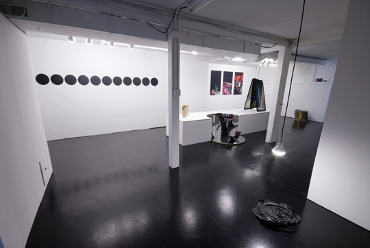
Ditch Projects, Installation view of Are You Ready for the Country?, 2010
Kudos to curator Moss for reaching out beyond Portland to pull in the collective Ditch Projects from Springfield, Oregon. I don’t know what it means for the future Portlandness of the biennial, but their exhibition, Are You Ready for the Country? where country is that which grows through cracks in the urban façade is a Portland2010 highlight. They describe it as celebrating “the urban center’s…submission to the rural margin,” displaying, “the trappings of this neo-rurality…crude plaza monuments and high-tech folk art.” This translates into works like sculptures of crystals suspended by pink cord in mylar-coated curves in boxes that double as plinths. On one of these a black light bulb is suspended in a lean-to of tinted car windows making Larry Bell-like minimalism of the discarded. There’s a series of matte black triangle on black circular paintings, and best of all, a pair of videos, one following the arranging and rearranging by a pair of hands of two small car windows into geometric forms on a table top and one featuring a tree-shaped air freshener going up in flames as it hangs from a rear-view mirror to the tune of the Eagle’s Best of My Love. As urban-educated artists who have made an alternative arts space in a small town near the University of Oregon at which they teach, Ditch Projects are mining “country” here through a kind of bug’s eye lens that refracts the romanticized and nostalgic in a very smart way.
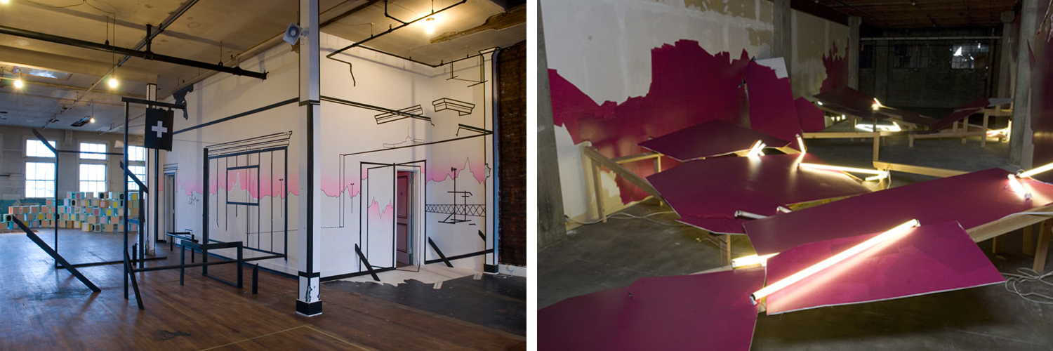
Damien Gilley, Zero-Sum, 2010, Masking tape, artist’s tape, airbrush, vinyl, wood (Left).Jenene Nagy, Destroyer, 2010, Drywall, wood, florescent tubes, latex, (Right).
Lucy Lippard said of artist Robert Huot’s works in 1966 “Huot’s interest in integrating the wall with his painting continued in monochrome paintings. The play between the two-dimensional surface and the objectness of painting led him to work in 1968 with lines of tape, attached directly to the wall….” Damien Gilley and Jenene Nagy deal with the same concerns in installations that define, reflect, and fracture space. Nagy’s installations have moved from monochrome wall paintings augmented by planes built out from those walls to fractured landscapes of monochrome planes at a remove from wall and floor to her Destroyer for the biennial in which hot pink canted planes dramatically bust through walls in a dark basement lit by tangles of fluorescent tubes. Destroyer is both powerful (violent) departure for Nagy, and a continuation of her negotiation with painting, wall, and space. Meanwhile, Gilley has been using large scale, tape wall drawings to bring the outlines of a streetscape to an interior or to call out and refract architectural features of a space. But he’s also thinking about perspective and the illusion of depth vs. the picture plane. For Zero Sum, his wall drawings, on facing walls and wrapping around corners both call out preexisting lines and craft distant landscapes. Possibly for the first time, Gilley places a house-like black-frame structure among his wall drawings, a form that turns up in the distance on one of the walls, turning the interior/exterior relationship inside out in a really interesting way.
I suspect that Crystal Schenk and Shelby Davis’ West Coast Turnaround, may end up being for the casual visitor the most memorable icon of Portland2010. Like this full-scale drywall replica of a semi-truck, Portland2010 is fully loaded, barreling toward the head lit-bright future of this intimately sized city with outsized arts ambitions and talent.
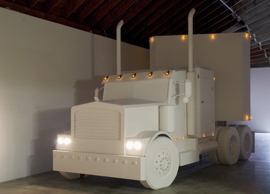
Crystal Schenk and Shelby Davis, West Coast Turnaround, 2009, 2x4s and drywall
Lisa Radon is a freelance writer living in Portland, OR.http://www.ultrapdx.com/zero/